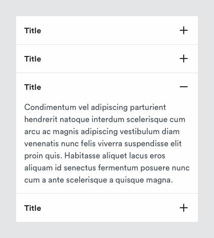
# Accordion
Accordions are a useful pattern for progressive disclosure — key information can be placed within the list of headings, and more detail can be revealed with a click or a tap.
# Description

Accordions can help with page length and reduce scrolling time, which can make it easier to scan the page and process the information. However, because the information is hidden it is important to account for users who may not view all of the content. Consider a different approach if it's necessary for the user to read all of the content.
# Must include
- Title - to indicate the copy within the accordion when closed.
- Plus/minus icon - to indicate if accordion panel is open or closed.
- Panel - section of copy associated with an accordion title when opened.
- Divider - except for the last cell in the accordion.
# When to use an accordion over a sheet?
Consider the length of content. Shorter content may be better suited to accordions. Sheets allow users to better focus on the content due to the modal nature of the component, reducing cognitive load.
If your content is of a consistent structure. For example, answers to FAQs.
If the user may have to make multiple selections, multiple accordion rows may be better suited to help the user make a decision. For example, filters.
When displaying groups of links. For example, links within a mobile footer
# Rules
Use Plus/Minus icons to denote closed/opened states:
These icons do not convey other meanings within our design system whereas.
Chevrons are used in multiple other ways. Most notably, sideway chevrons are used to indicate additional content in a sheet or that the user will move to another page.
Last row in an accordion group should not have a key-line at the bottom.
Icon should always be right aligned to content:
Although the whole component area is tappable, users will tend to interact with the icon. Right alignment is easier to reach on mobile devices.
Key-lines ensure there is a visual connection maintained with the accordion label and icon.
# Accessibility
- The accordion header should be concise but descriptive of the information held in the accordion panel. This will also be useful to those users using assistive
- Provide a visual indicator to be clear on the state of the accordion. We use the plus icon to show there is more information to be shown within the panel, when the panel is open the icon will change to minus icon
- The full accordion button must be selectable to help users who might have dexterity conditions or those with visual impairments
- Consideration must be taken when looking at ARIA for accordions.
- Accordions should be a minimum of 56px high
For more information on disclosure visit https://www.w3.org/WAI/ARIA/apg/example-index/disclosure/disclosure-faq
← Patterns Breadcrumb →
