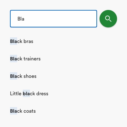
Search is a well-known component that allows users to quickly find products on our sites. Users can input a query into the search input field to view a list of relevant results. component that consists of a field and an icon button.
# Description

The key parts of the search component are the search field and search button. As an important tool for helping customers find what they want on our sites, the field is styled differently from others on the site (i.e. with a rounded edges) to make it stand out. Users can type a query into the field using their keyboard. The search button will submit the query and the system will show responses back to the user. As an important tool to help customers progress in their journey on site, this button is a primary button and as one of the few universally understood icons the field/button does not require a visible label
The main search itself sits at the top of the viewport, within a sheet and can be accessed from the main navigation. This sheet can display the previous queries a user has searched or suggested responses to the users input to help speed up their task. The queries are displayed in styled cells.
Search components can also be used elsewhere on the site where the customer may have reached a dead end (e.g. 404 pages, no search result pages).
# Rules
- Clarify what users can search for using relevant placeholder text. E.g. "Search for dresses"
- Always accompany search button with magnifying glass icon
- Provide a search button to submit content in the search field.
- Relevant alphanumeric keyboard should be displayed on mobile with 'search' or 'go' depending on users OS
- If there are no results in response to the users search term - explain that there are no matching results and offer starting points for moving forward (‘start shopping’, 'take me to homepage’, 'search again')
# To consider
- While not essential wherever a search field is present, search history and suggested results are beneficial for the user, so if space allows, consider allowing
- Consider allowing the user to clear their search history
- Where the user has made a common spelling mistake, communicate this to the user and show results for the corrected search term
- Where the user has searched for a category that matches the same name it may be simpler to redirect them directly to the category page.
# Accessibility
- Avoid using placeholder text as this has a poor contrast ratio against the background colour of the search field. Instead, use a meaningful label.
- Make sure there is a perceivable 'search' button for user to interact with. We show the search button once user has entered a minimum of 3 characters.
- Highlight the search field using a contrasting colour to indicate to the user that form is focused on.
- The search button must adhere to the minimum clickable area of 56px.
- The search button must have an ARIA label describing magnifying glass icon as the search function, to ensure screen reader users know interacting with this button performs the action.
← Radio button Sheets →
