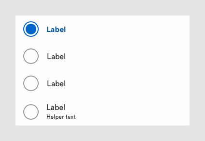
# Radio Button
Radio buttons are used to display a list of mutually exclusive options where the user can only select one option at any time.
# Description

Selecting an in-active radio button will deselect whatever other radio button was previously selected.
Radio buttons should not to be confused with checkboxes, where the user can select multiple options.
# Must include:
- Input - to indicate radio button state (selected by default)
- Label - to describe the choice that can be selected.
- Group title - to describe the group of radio button options.
# Optional
- Helper text - to indicate what radio button label means.
# Rules
- Observe the minimum touchpoint area (56px).
- Allow users to tap/click the entire radio button area, rather than just the circle.
- Make sure one option is always selected by default.
- Give radio buttons meaningful labels.
- Avoid using radio buttons if there are too many options in a list to select from (5 or more); Use a dropdown instead [link to dropdown page]. However, always question if it is necessary to have that many options.
- Avoid displaying radio button groups horizontally. This makes it difficult to separate each item within the list.
- Show error messages after the user submits a form.
- Make sure the form has a submit button.
