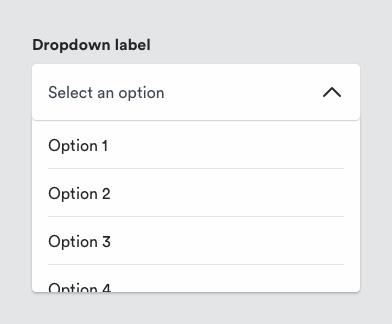
# Dropdown
A dropdown list allows the user the select one value from a list of options once the user has interacted with the dropdown control. Dropdowns often appear in forms.
Consider whether dropdown menus are appropriate to your design. A toggle, a radio button/pill selector or an input field may be more appropriate, depending on the number of options available to the user.
# Description

Dropdowns consist of a control and selector. When the user interacts with the dropdown control, the system presents available options to them in the selector. The user can then can choose one of these options. Generally, the selector pattern is native to the browser/os UI either as a modal or non-modal element. Selectors can be customised if required at the risk of additional complexity.
Dropdown controls can be pre-populated with a default selection or contain a prompt to make a selection (e.g. Select a title), in which case error handling might apply.
# Must include
- Label - to indicate what the dropdown list will consist of.
- Control field - interactive element present whether list is open or closed state.
- Selector - a list of options in dropdown in open state.
- Chevron - to indicate open/closed state of dropdown menu.
# Optional
Helper text - to provide guidance to the user on dropdown options.
# Rules
- Dropdown controls should have a label associated that describes the list of options.
- Use a downward chevron icon to the right of the control to indicate a dropdown interaction.
- Dropdown fields should meet minimum tappable area requirements (i.e. 56px x 56px). The width of the control should reflect the length of the available options.
- Use dropdowns when users need to make a single selection from a list.
- Display available options fully to users. Label options concisely to avoid any truncation.
# To consider
- Dropdowns are appropriate when there are 4-7 options for the user to select and if space is at a premium. Other patterns may be better for the user if they can show them available options before interacting with the element (e.g. radio selectors).
- Consider Jakob’s law of UX when considering creating custom dropdown selectors. Users are likely to expect (and be more familiar with) the pattern native to the OS or browser versus the customised selector. Additionally, these add complexity from a code POV.
