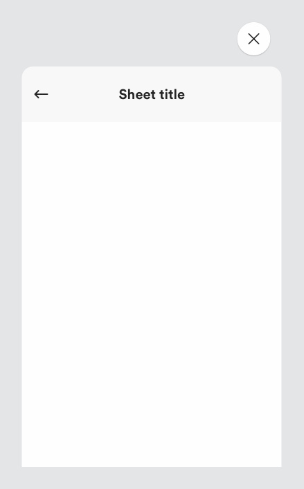
Sheets or context cards, help us keep our users in context. By only showing users key information initially, sheets give users control over what information they do or do not see.
# Description

# Small screens
- Sheets slide in from the bottom of the page and have 3 different positions:
- Open to the length of the content (if the content is less that 75% of the screen)
- 75% of the screen if the content runs longer
- Open to a full screen position
If there is overflow content and a user scrolls to view the rest of the content below, the sheet will open full screen.
# Large screens
Sheets slide in from the side of the screen and by default there is only one full state. The user can scroll through information within the sheet, but this won’t change the size of the sheet.
We can also include related tabs within sheets allowing users the ability to easily tab through the information they are looking at without having to leave the sheet. Sheets can contain buttons, links, text, icons, and imagery - all within the user’s reach.
# Must include
- Header - to indicate the sheet title.
- Close button - to close the sheet.
- Sheet content.
# Optional (all sheet variants can be found in Zeplin)
- Arrow icon - for second level sheets
- Primary button - indicates the primary action within the sheet.
- Secondary button - indicates the secondary action within the sheet.
- Sheet tabs
- Sticky footer
# Why we use sheets
We use sheets in multiple scenarios: size selector, filter & sort, add to bag, order summary and so on.
Sheets allow users to stay focussed on the content they have chosen to view. Sheets enable the progressive disclosure of information, reducing the cognitive load for the user. Sheets also save time for the user, they can find information quicker and easier through sheets rather than having to scan through multiple paragraphs of information.
# Sheets vs. accordions
- Consider the length of content. Longer content may be better suited to Sheets. Sheets allow users to better focus on the content due to the modal nature of the component, reducing cognitive load.
- If your content is of inconsistent structure for example, product information and delivery information then use a sheet.
# Rules
- Always include a close button so the user can exit the sheet easily.
- The sheet should always include a title, this will help the user understand what the information is about.
