# Carousels
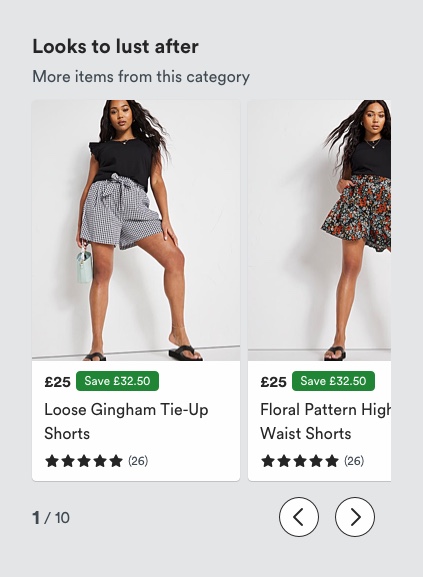
Carousels are groups of items that occupy the same horizontal real estate.
# Description

Items in the carousel tend to be similar whether it be imagery, product cards or buttons in the form of pills or quicklinks. The items within carousels can themselves be primary or secondary clickable elements or non-clickable elements in the form of images. This is a commonly used pattern across the web, so is recognised and understood by our customers
# Must include
- Heading - to indicate within the carousel
- Content components (e.g imagery, pills)
# Optional
- Sub-heading - to provide more information on carousel content.
- Item number - to indicate item currently shown on carousel.
- Left + right navigation icons - to allow user to navigate images within carousel.
# Why do we use this pattern?
- Allows us to focus the users’ attention on a smaller number of items vertically.
- Reduces the number of clicks required for users to see similar content grouped.
- Vertical space required is significantly reduced using this pattern.
# Component
- There are several different types of carousels available in NBUX.
- Product card
- Image only
- Category quicklinks
- Pills
- Hero carousel
- Gallery
On mobile and tablet content in carousels tends to bleed off the edge of the viewport to indicate the presence of more content, this is more evident on mobile, where smaller viewports limit the amount of real estate available for content.
On desktop, we understand it's not easy for users to scroll sideways, therefore we add navigation arrows so it's easier for the users to scroll through the content or stack the carousel content vertically
The use of carousels also allows us to establish a hierarchy for the items within the carousel, for example, this is particularly true for hero carousels present on homepages.
The use of navigation arrows is often utilised to support accessibility and allow for easy navigation. When utilised, the position of nav arrows is below the carousel and this remains consistent across NBUX.
# Rules
- Bleed content off the edge of the viewport to indicate more content exists - dependent on the device
- Have a maximum number of times a user will click in a carousel - no more than 4 slides per device.
- Don't auto-forward content - this practice would contradict accessibility guidelines.
# Things to consider
- Consideration needs to be taken for the viewport size as this will determine the number of elements shown within a carousel.
- Some carousels may also contain a primary CTA at the end, this enables users to easily navigate to more of the same content.
- On desktop, it is not as easy to scroll sideways, as such content is stacked vertically (insert link).
- The use of navigation arrows for accessibility.
# Accessibility
- To support users with cognitive impairments, display carousel controls to allow users to move through the content.
- Carousel controls should not be positioned on top of carousel content.
- Carousels should not employ automatic animation as this can be distracting for certain users.
