# Notifications
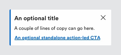
Notifications display important information and may provide essential actions for the user to take and help highlight the information being communicated. Unless specified, notifications should appear at the top of the page, under the main navigation.
# Description

Use notifications to keep users informed about an update or status change they should be aware of. Notifications can be dismissed automatically or require user action.
Define the type of a notification by a colour border on the left side of the component.
# Must include
Message - to provide detail to user of what the notification entails.
# Optional
- Title - to indicate key message to the user.
- Link - Action allowing user to address notification.
- Close button - clickable 'X' icon to close the notification box.
# Notification types
# Success
Use a success notification when a user completes actions successfully such as adding a card, saving an address or updating a password.
# Information
Use an information notification to explain to the user the context of their current task, additional information that is not directly relevant to their current action. For example, use it to show an estimated delivery date on a PDP.
# Warning
Use a warning notification to tell the user their progress may be impeded unless action is taken. For example, informing the user they are about to go over their credit limit but can split their payment between a card and a credit account.
# Error
Use an error notification to tell the user that something critical has happened and requires immediate attention e.g. validation errors, service errors etc. A similar component also exists for displaying errors within a form.
# Rules
- Be concise but informative with the information within the notification
- If using an error notification be sure the message is clear enough so the users knows what actions they need to take
- Error messages should not include an icon to remove the message, once the user has taken the necessary actions to continue only then will the error notification disappear
# Accessibility
When the notification is displayed, ensure it doesn't disrupt the user's current task. Stagger the notification announcement until the current task is completed.
- If the notification is urgent, ARIA alert role can be used. ARIA alert role is less disruptive to users than the ARIA assertive role.
- People with physical disabilities often need more time to react, process information and complete activities so as part of our guidelines, we don't recommend using timed elements. Using timed notifications that disappear too quickly can fail the optional WCAG 2.0 success criterion 2.2.3 (AAA).
- Colour should not be used as the only way to identify the type of notification.
# Resources
Usage of ARIA names, state and roles for alerts - https://www.w3.org/WAI/ARIA/apg/patterns/alert/
Tutorials on notifications accessibility - https://www.w3.org/WAI/tutorials/forms/notifications/
← Navigation Pills →
