# Error Summary
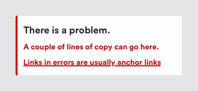
An error summary is displayed at the top of a page to summarise any validation errors which have occurred in a form.
# Description

When 2 or more validation errors occur on submit of a form, you must show both an error summary at the top of the page and an error message on each input that contains an error.
A similar component exists to communicate general errors, however for those errors anchor links should not be used. See notifications for more information.
# Must include
- Heading - to indicate to a user that an error has occured.
- Link - to take a user to the field where an error has occurred.
# Heading
The heading must always be 'There is a problem' to communicate to the user an error has occurred.
# Anchor links
Each error in the summary must link the user to the corresponding error on the page.
# Rules
- The error summary should always appear at the top of the page above the
h1but below a breadcrumb, if one is present. - Move keyboard focus to the error summary
- The anchor links messages must match the error messages on the page
- Always include the heading 'There is a problem'
- Do not display an error summary if there is a single error on the page. Set keyboard focus to the error on the page allowing the user to fix it straight away.
# To consider
- For grouped inputs, such as radio buttons, the anchor link should set focus to the first element in the group.
# Accessibility
- The error summary should have a heading so that it is easy to identify.
- Each error listed should:
- Provide a concise description of the error in a way that is easy to understand by everyone;
- Provide an indication of how to correct mistakes, and remind users of any format requirements;
- Include an in-page link to the corresponding form control to make access easier for the users.
For more information on disclosure use: https://www.w3.org/WAI/tutorials/forms/notifications/#listing-errors
← Dropdown Icon buttons →
