# Layout
# Content first
‘In order to create the right layout and structure for any digital experience, you have to know what the content is first’ - Jeff Zeldman, founder of A List Apart. And just to note using placeholder text doesn’t allow you to create accurate designs and can cause friction within the design process, so steer clear!
Before considering designing a layout, we first need to understand the page goal. The design should be focused on achieving those goals.
"What's the customer expecting to do on this page?" "How might we help them with their task?"
# Visual hierarchy
Visual hierarchy refers to how elements are organised on a page through scale, colour & contrast and grouping. It allows users to navigate easily through a page and without it users could struggle to focus.
Designing a page for any online application involves communicating your offer to visitors in a clear and direct way.
Size can play a key role in visual hierarchy; bigger elements stand out and attract more attention.
Brighter colours and high contrast naturally stand out more, however we don’t want to overwhelm our users when visiting the website and isn’t very useful to those with colour blindness, something to bear in mind when designing.
It’s important to use white space to declutter the page and adding a contrasting CTA are just a few ways to accomplish this.
Ultimately, design is not just about how elements look, but what message they convey to our customers.
# Page scanning
People are more likely to quickly scan a web page than to read everything on it, it helps users quickly find what it is they’re looking for.
The are many page scanning patterns which users employ on the web, two of the most popular are the Z and F shaped patterns. For text-heavy pages, the F pattern is more widely used, whereas the Z pattern is common for pages which aren’t text-oriented.
# F-pattern
The F-pattern on desktop and mobile dictates that visitors first read the page in a horizontal direction, mostly along the upper part of the content area, then move down the page and read across a second horizontal line. Finally, visitors scan the left side of the content in a vertical movement.
This is what the movement typically looks like:
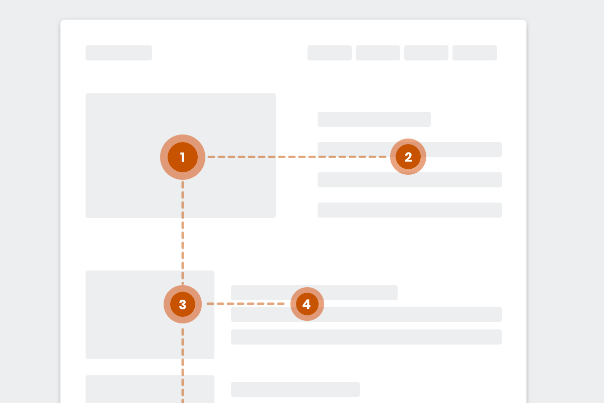
Fig 1. Showing a low fidelity mock up of a common F-pattern
For elements you want visitors to notice on a text-heavy page (like an image), placing them in the F pattern increases the chance of the elements being seen.
Designing with the F shape pattern in mind helps to create designs with good visual hierarchy, a design that users can scan easily.
# Z-pattern
The Z-pattern layout is typically used on pages that are not content heavy. Its design mimics the route the human eye travels when it reads — left to right, zigzagging top to bottom:
Visitors first scan from the top-left to the top-right, forming an imaginary horizontal line, they then scan down and to the left, creating an imaginary diagonal line.
Lastly, they look back across to the right again, which forms a second horizontal line.
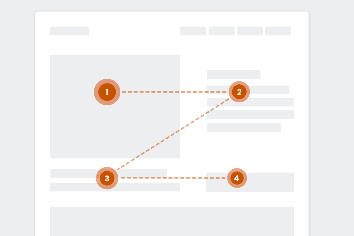
Fig 2. Showing a low fidelity mock up of a common Z-pattern
Just like F-patterns, the Z-pattern layout does not have to be an exact Z-pattern. The horizontal lines do not have to be exactly horizontal — they can be angled as well. There can be multiple Z’s throughout the page. Just make sure that: The top horizontal line includes the main components you want visitors to focus on first.
The diagonal line should feature any piece of information that lead to your CTA button.
The bottom horizontal line should highlight the CTA at any point along this line. Placing the most important page elements along visitors’ natural eye paths, whether in an F or Z pattern, ensures you create an engaging experience.
# Designing a layout with NBUX
# Column Grid
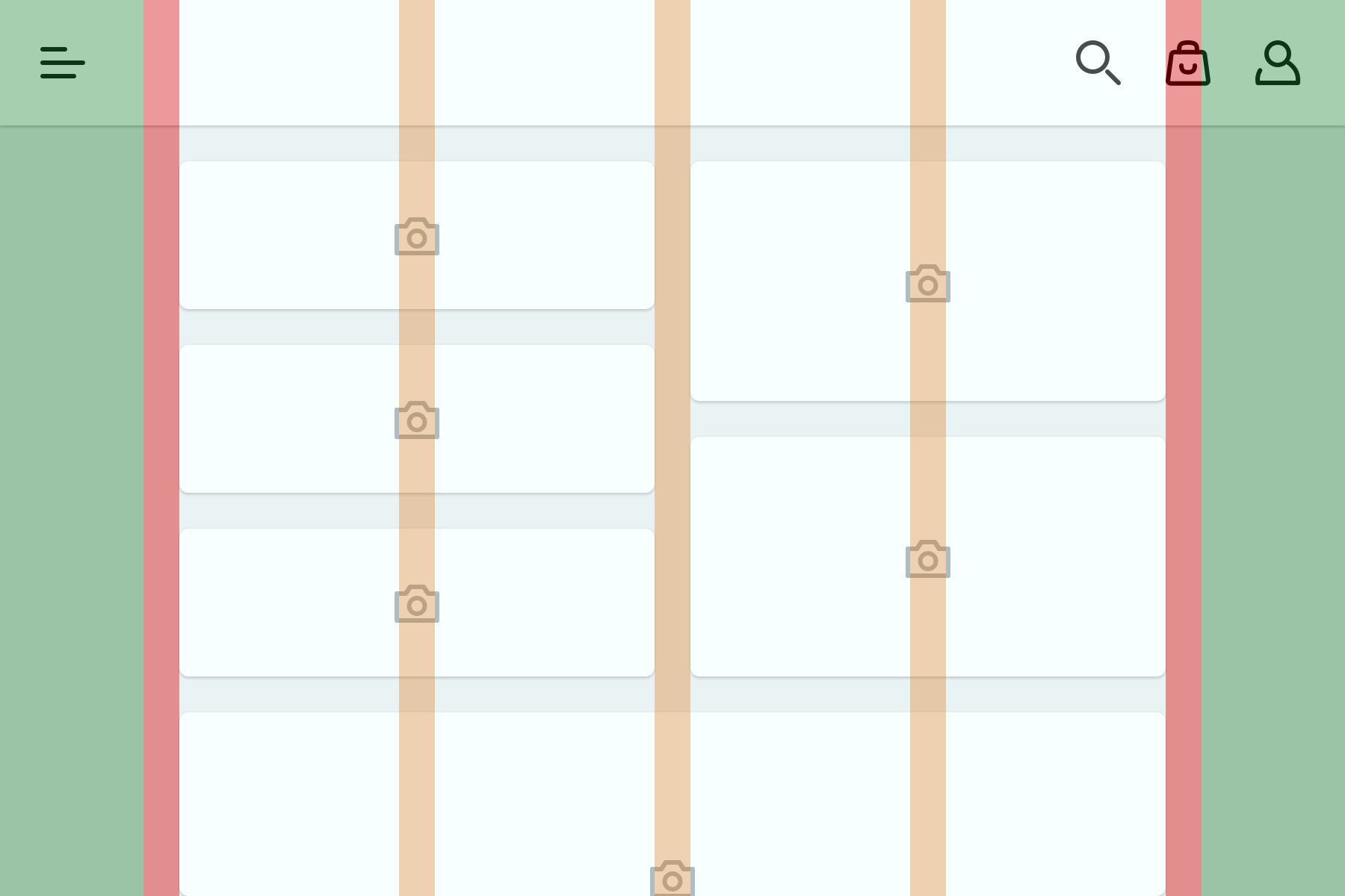
Fig 3. Column grid layout separated by gutters, with margins at the sides.
The column grid is a layout container made up of a number of columns, the margins separate the columns and the gutters sit on the outside of the grid. The column grid layout allows us to align the content to create cohesive layouts helping to adapt to different screen sizes and making it easier for users to scan.
The number of columns a layout has is based on the screen size of the device being used. At specific screen sizes we'll adjust the number of columns to better suit the layout.
# Breakpoints
NBUX provides breakpoints based on the most popular devices accessing our websites today. At each breakpoint the layout sets the number of columns, margins and gutter spacing. The breakpoints defined are set to suit smaller or larger screen widths.
At N Brown the breakpoints we use are:
| Mobile | 360-413 and 414-567 |
| Tablet | 568-767 and 768-1023 |
| Desktop | 1024-1366 |
| Large Desktop | 1367 and up |
Our library of components has been designed with the layout grid in mind to be as flexible as possible: library of flexible components.
# White Space
# Gutters
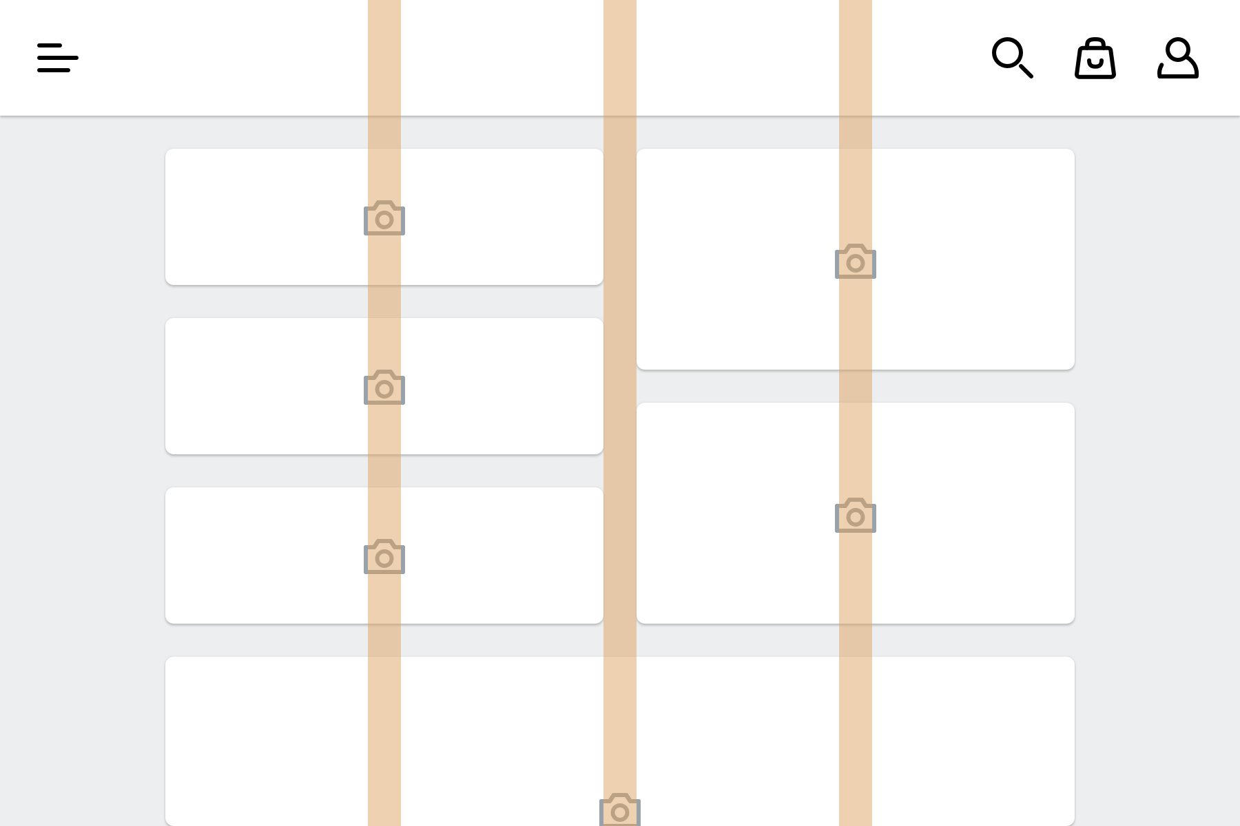
Fig 4. Gutters between columns.
The gutters used in NBUX are a fixed width. This width may vary at different breakpoints or between devices (e.g. iPhone 8 vs a standard Android phone). Gutters are used to separate columns and content.
# Margins
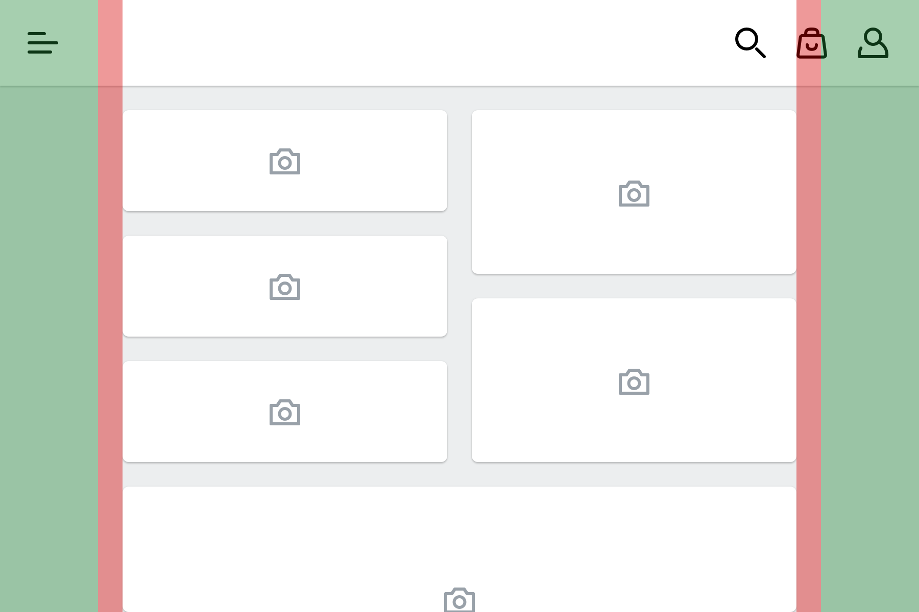
Fig 5. Margins to the left & right of the column grid. Header stretches edge to edge.
Margins provides space to the left & right edges of the column grid. Content does not live in this space and is intentional white space to important content doesn't touch the edge of the screen. Margins typically grow with screen size.
# Grouping
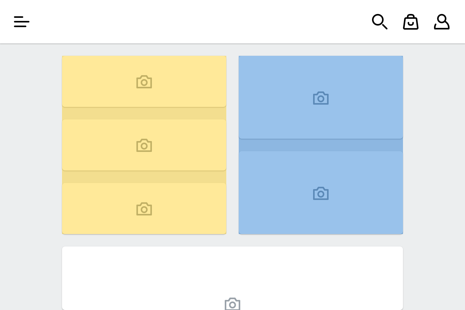
Fig 6. Example of how white space groups elements.
White space should be used to organise the layout for the user and group similar elements or actions together.
Law of proximity states that - “Objects that are near, or proximate to each other tend to be grouped together. Proximity helps to establish a relationship with nearby objects, which in turn helps users understand and organise information faster and more efficiently.”