# Accessibility
Accesibility must be a fundamental part of our content to make our experiences inclusive.
These guidelines explain how to make websites and apps accessible for all users. This includes people with the following impairments:- Vision
- Hearing
- Mobility
- Thinking & Understanding
# WCAG checklist
The WCAG (Web Content Accessibility Guidelines) are a set of recommendations for content that meets the needs of individuals and organizations.
Here are the full requirements to meet WCAG: WCAG guidelines
# Colour contrast ratio
Insufficient contrast in our products makes content hard to read for everyone. Consider the colours you use and the size of fonts when creating content. Using strong contrasting colours can make information stand out. A colour contrast calculator can help you accurately analyse the contrast in our products.
Color Review provides clear accessibility guidelines on contrast, allowing you to test text and background colour contrast ratio to ensure they meet Level AA standard.
For our websites, we aim to meet the following standards:
Level AA 4.5:1 – Second level of conformance set by WCAG – requirements that web developers should satisfy, otherwise some groups may find it difficult to access the web content. We will meet this standard on most of our content, unless it isn’t technically feasible to do so with the chosen format.
# Users with disabilities
Following the WCAG checklist, content needs percievable, operable, and understandable to all users, regardless of ability.
Make sure content can be interacted with using a screen reader or other assistive technology (such as screen magnifiers and high-contrast modes).
Give imagery appropriate and understandable alt text.
Provide keyboard functionality. This includes using the tab key to select different elements on a page and using enter to select the focused element.
# Screen readers
What are they?
Screen readers are a tool used to read aloud the information on a webpage or app. They are used by non-sighted users who are unable to perceive the content on the screen using sight.
Why are they important?
It's important that people who cannot perceive something visually get the same information as those who can. Screen readers allow these users to do this, though there are things we should consider when designing to make sure our content is accessible for screen readers.
A sighted user may read the content on a page differently than someone who is navigating with a keyboard. For users navigating using a keyboard, we need to ensure that the content is structured in a way that makes sense when read out by a screen reader.
Use succint, readable text desciptions for links instead of long URLs will aid someone using a screen reader.
For moving content, we should allow users to play, pause or stop so that the information is not read out automatically.
Use alternative text for images and iconography where appropriate.
# Alternative text
It's important to consider using alternative text as it provides a description of an image to users relying on a screen reader.
Good alternative text gives context beyond a generic explanation of what an image, meaning a non-sighted user can get the same level of description as a sighted user would when viewing an image.
# Designing for touch
Touch
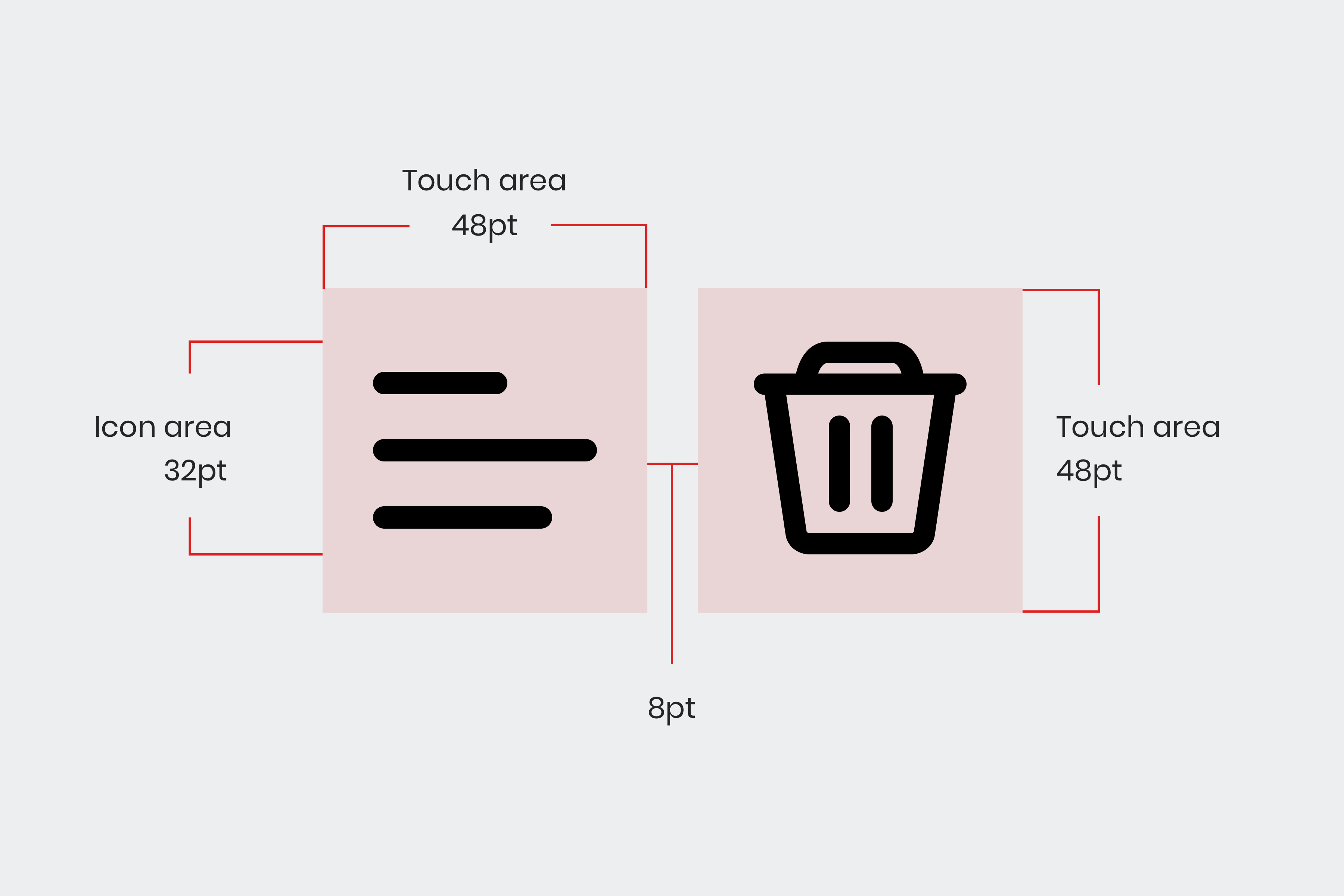
Touch targets refer to the areas of the screen that respond to user input. The target is usually the input itself, but it can also refer to the area around it. The touch target areas should be a minimum of 48px.

Fig 10. Recommended touch areas for icons.
Don’t forget to follow the ‘8px spacing’ guideline above so that larger target areas will align to the baseline grid.
It is best to make touch targets bigger rather than smaller as this will benefit our older users or users who may have motor/visual impairments.
Consider that most users prefer using a thumb to tap buttons and scroll, whilst holding the device in the same hand.
Pointer
Target areas for a mouse, trackpad or stylus should be a minimum of 24px, and at least 8px apart.
# Patterns and components
It's important to consider how customers interact with our sites. For instance, people tend to tap on the button of a radio input, or the box of a checkbox (even if the whole area is tappable). Our checkboxes, radio buttons and toggle switches are designed with this in mind.
See patterns for more information.
← How we design Colour →