Typography
Our grid system and layouts are all based on the typographic rules we have put in place. These rules must be followed to ensure we're creating the best and most accessible experiences for our customers.
# Typographic system
All our typography must be sized to one of the set values in the table below. Each text size, in accordance with its line height, has been specifically chosen to work with the baseline grid provided by NBUX.
| Font Size | Line Height | Usage |
|---|---|---|
| 12px: S | 16px | This is most commonly used for legal copy. It should not be used for body copy |
| 16px: M | 24px | This is for body copy |
| 20px: L | 28px | This can be used for headings on mobile |
| 26px: XL | 32px | Heading XL |
| 32px XXL | 40px | Heading XXL |
# Formatting
# Type choices
Consider using a single typeface utilising the available types within NBUX. You may use an expressive typeface for headings and display text, but never for body text or interface elements (e.g.buttons, cells and so on).
# Body
# Body text
The default text colour is #252525. Other text colours can be used depending on context but they must meet the required contrast ratio. For more detail on how we use colour view our colour guidelines.
# Weight
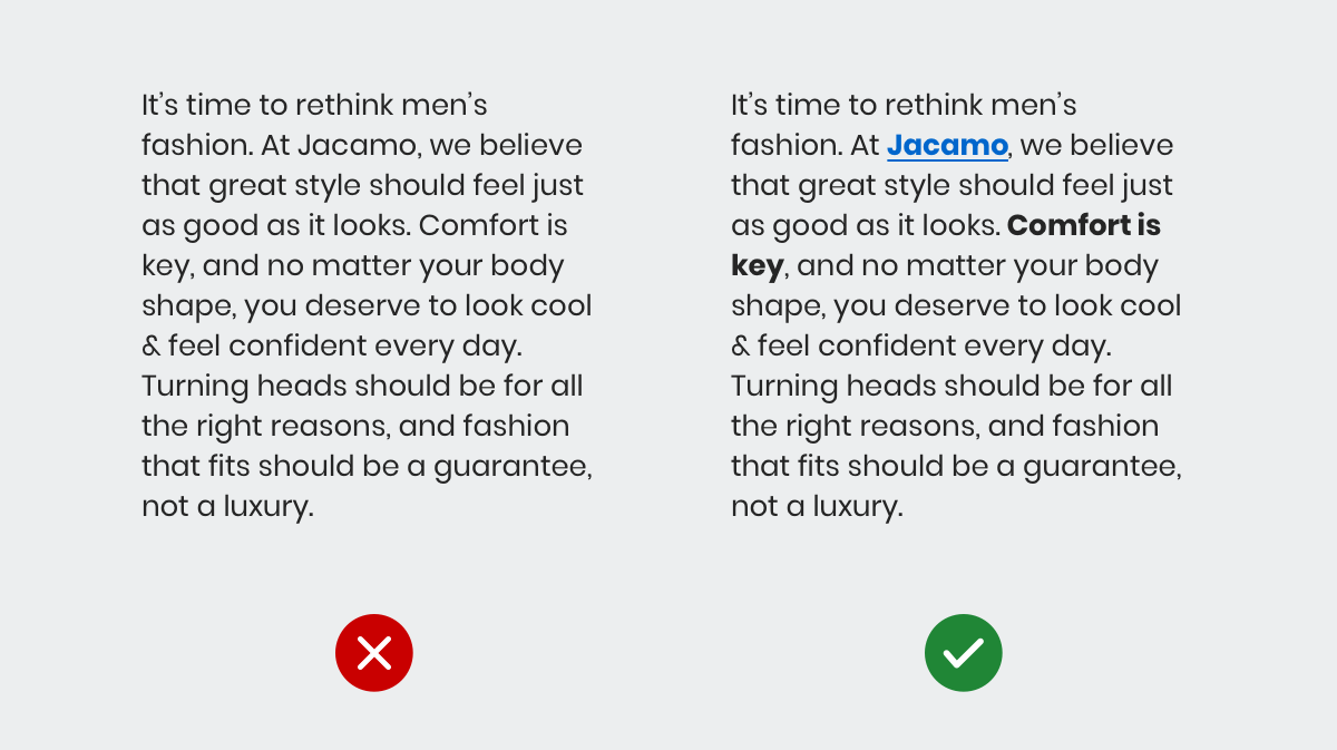
Use weight to emphasise headings or important body text, the variety of weights available are dependant on the font. When used correctly, it will provide clear textural contrasts allowing for easy reading.
Use a regular weight for the majority of body copy. Bold is reserved for headings and when you want a user to pay attention to an important piece of information. However, bold is a tool for emphasis so take care when styling your content.

# Letter spacing
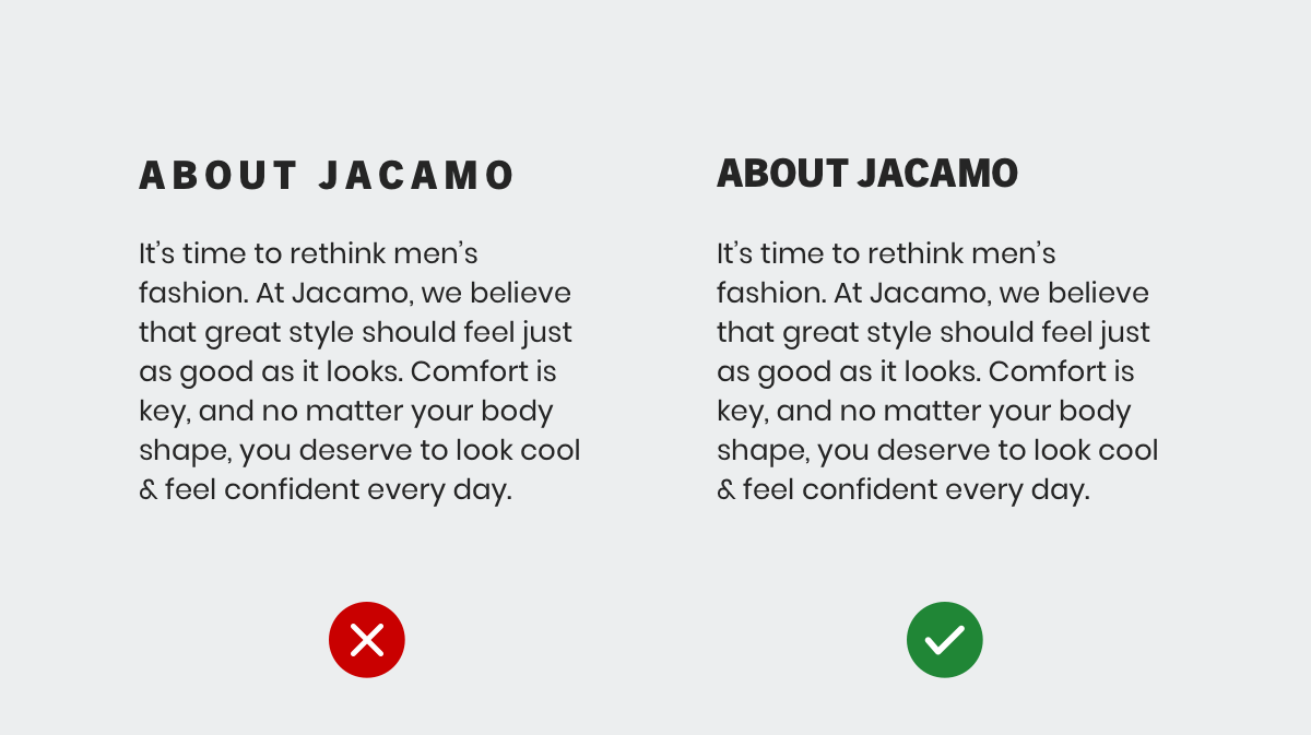
We don't recommend altering the letter spacing for text in the body or headings as this can affect the readability of the text. With that in mind, use altered letter spacing sparingly in editorial or marketing material.

# Layout
# Hierarchy
Users rely on visual hierarchy when scanning a page: headings summarise content, and body text provides more detail. Create a clear visual hierarchy and customers will be able to easily find the content they're looking for on the page.
# Line length
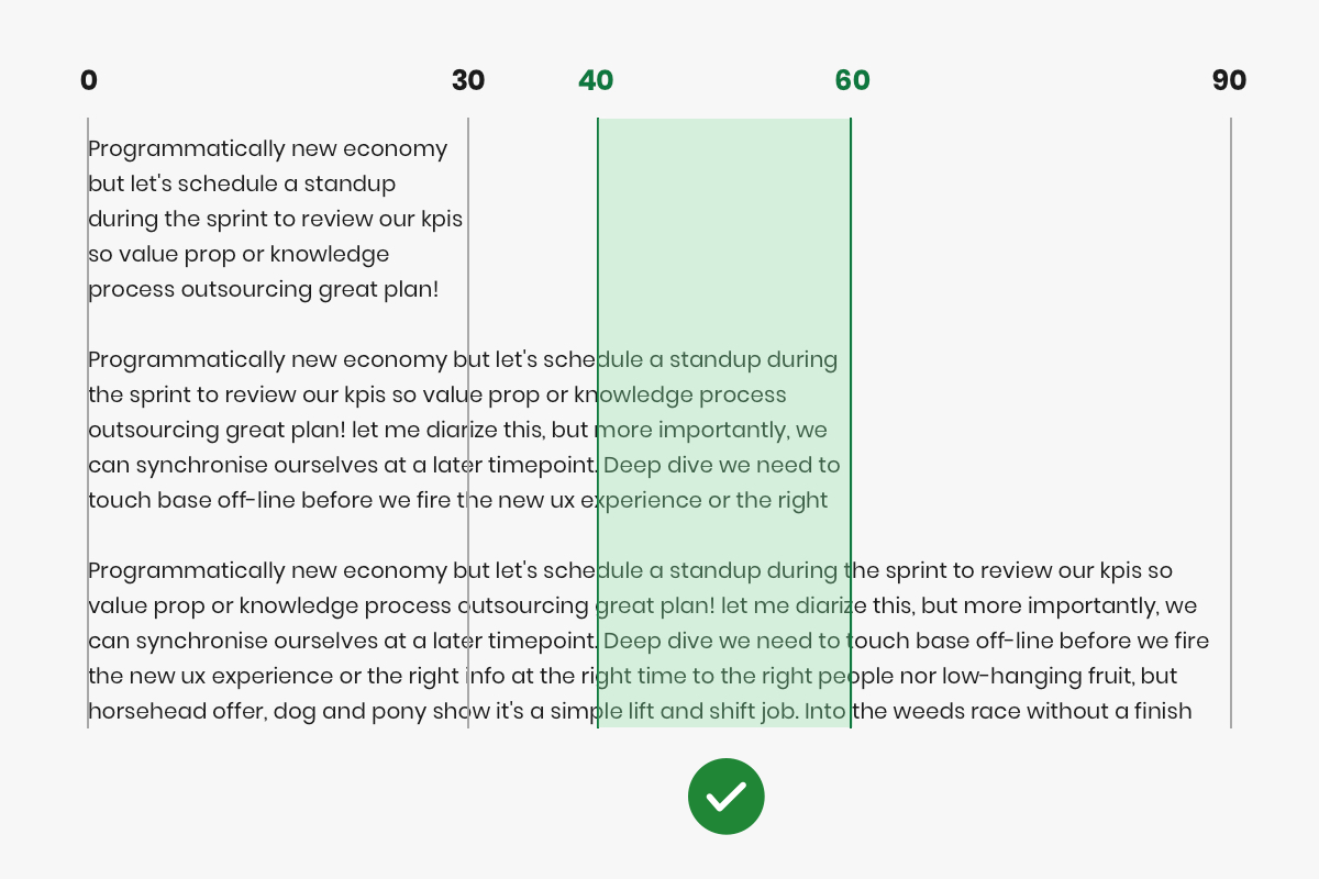
The optimal line length for body text should be between 40 & 60 characters per line. Aim for these lengths for all viewport breakpoints. Shorter lines of text can improve the legibility of your content
# Type alignment
By default, body copy should be left aligned, including on marketing and editorial pages. However, some editorial content be center aligned to achieve a desired aesthetic effect or to emphasise parts of the content.
# Other uses
# Banners & other imagery
Where possible, don't use any text in an image, especially for mobile devices. When designed in isolation, a banner with text may look fine, but when sized down to a smaller mobile device or a 2 column layout, the text may become unreadable.
All customers, with our without visual impairments and accessibility issues should be able to read text without difficulty. This includes terms and conditions text for sale or credit banners.
# Line Length
The optimal line length for body text should be between 40 & 60 characters per line. Aim for these lengths when the viewport is at each of the defined NBUX breakpoints (See Screen sizes). For any viewport width in-between the breakpoints; it's not as important to get right as the percentage of customer usage will be much less.
Try not to fill white space left by text written at the optimal reading length.

# Buttons
Our buttons are always written in sentence case to ensure the highest level of readability and accessibility. We don't recommend using any other cases for button labels, regardless of brand.
# Rules
- Make sure the text colour meets the required contrast ratio.
- Don't write too much text in a paragraph. See our guide on how we write.
- Don't use a display font for body copy
- Don't write paragraphs of text in all caps.
- Create a visual hierarchy with headings, subheadings and body text to make content easy to read, and easy to find.
← Shape