Banners
We use banners to promote content or products that we want our customers to see.
They are a very effective way of calling out an offer or showing we've got a new range of products. They're often the most prominent thing on the screen, so should be designed carefully and with consistency.
# Banner hierarchy
What should a banner include? We need to consider:
- The value proposition - why should I care?
- The call to action - what should I do?
# Banner blindness
“Banner blindness is a phenomenon in web usability where visitors to a website consciously or unconsciously ignore banner-like information, which can also be called ad blindness or banner noise.”
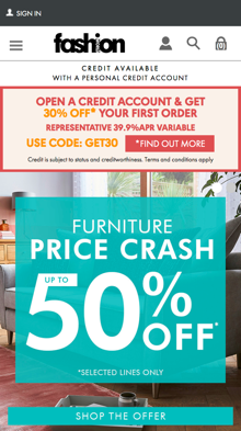
This can lead customers not reading the whole banner and just skim reading the main headline. In the example below, there's some terms and conditions in the banner which the customer hasn't seen, leading to order abandonment.
# Whoops
"Set up account but did not get 30% discount!! so have not placed order."

Do
- Consider banner blindness
- Be mindful of minimum font sizes
- Write succinct copy - we know most users skim read even important information
- Include a link or button to terms & conditions text
Don't
- Don't include too much text. See our guide on how we write
- Don't ssume our customers read every word
- Don't use a text colour that doesn't pass our accessibility guidelines
# Hero banners
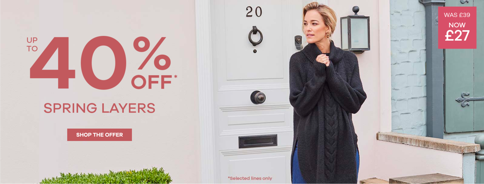
Below is an example of a hero banner taken from the JD Williams homepage on 28/01/2020.

Do
- Have the model look towards the call to action
- Make the offer clear and obvious
- Use clean and uncluttered imagery
- Use alt text on images
Consider
- Write in sentence case instead of in all caps - it's currently quite "shouty"
- Increase the size of the button - it's quite small
- Reduce the chance for confusion. The pricing on the right takes attention away from the offer. When clicking through to the Product List Page from this banner, the coat for £27 isn't in the initial list of products the customer can see.
- Use a darker background colour as the contrast between the background and the text only just passes 3:1 for large text
Don't
- Don't use an image in place of text. This increases page load time due to having to download multiple assets and is also not very accessible.
- The "selected lines only" text embedded within the main hero image. It's very hard to read and is quite pixelated due to image compression
- When clicking on the banner, the product window banner background is a completely different colour. Aim for consistency
# Image composition
Research tells us that when a model is looking towards the call to action (usually a button), there's a higher click-through rate on that button. It's a subtle way of pointing towards where we want the customer to click or tap without having to over-design the banner.
Do
- Have the model look towards the call to action
- Check colour contrast ratios for text
Consider
- Think about how text is going to appear over a banner, especially on mobile. Does the text cover the model's face?
Don't
- Use text directly within an image - text should always be "live" HTML