App
# Homepage structure
We want our app homepages to be engaging and a place for our customers to come back to again and again. We know that our app customers are loyal and therefore should see relevant content and not be bombarded with messaging without purpose.
# Banners
The same rules apply for app banners as any other banner type - so read our guidelines here. However to break it down even further:
Do
- Keep banner content succinct - only tell the customer what they need to know at that moment
- Write a clear value proposition
- Use one type of call to action
- Use descriptive copy in the call the action
- Use a text colour which adheres to our accessibility guidelines
- Use imagery with areas for copy space
Consider
- Consider telling customers where they can find full terms and conditions, e.g. "Full T&Cs on our website"
Don't
- Don't give the customer too many things to think about
- Don't write wordy terms & conditions
- Don't assume customers read every word
- Don't use different 'button' sizes - keep it consistent
- Don't overlay text over complex images
# App banner example
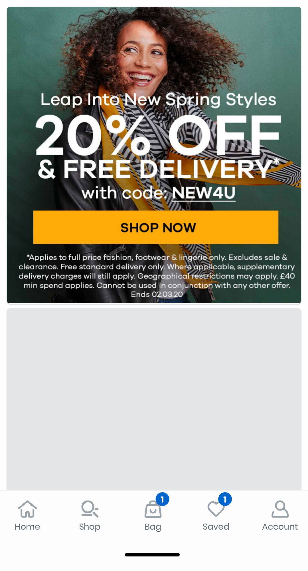
This banner shows how too much content can feel crowded and lead to customers ultimately not reading the content or the offer.
The text is squashed into a small space at the bottom of the banner and has full terms and conditions text. It's also difficult to read.
It is not clear where the customer will be taken to if they tap on the banner.
To improve the banner, we could make sure it's accessible by checking that font is readable on top of the image. We could also strip back some of the text content to make it easier to digest, such as the Terms and Conditions.

# Carousels
When possible, we should look to recommend products to our customers directly on the homepage, using carousels. We also use carousels to promote brands, categories with selected products, or to display a list of recently viewed products.
Do
- Link through to a Product List Page from a carousel
- Limit carousels to 20 products
- Separate carousels with banners
- Always place the 'recently viewed' carousel in the same place (e.g. right at the bottom of the homepage) so customers who come to the app often know where to find it
Don't
- Don't stack carousels on top of each other, e.g. a brand carousel above a recently viewed carousel
# Brand carousels
To match the dimensions below, you can design at the size the carousel item will appear in the app, (e.g. 164px * 290px) and then export them @3x. See this article for an in-depth guide on device pixel density. We recommend exporting designs @3x so they are displayed nicely on devices with high pixel density displays (e.g. iPhone, Samsung Galaxy S).
# Mobile app dimensions
| Width | Height | Exported size @3x |
|---|---|---|
| 164px | 290px | 492px * 870px |